
Last Updated: November 21, 2026
Quick Summary
The seven best warm neutral paint colors for 2026 are Benjamin Moore Navajo White, Sherwin-Williams Accessible Beige, Benjamin Moore Revere Pewter, Sherwin-Williams Agreeable Gray, Benjamin Moore Pale Oak, Benjamin Moore Ballet White, and Farrow & Ball Elephant’s Breath. Warm neutral paint carries yellow, red, or green undertones that hold their softness through the day instead of going gray.
- Warm neutral paint carries yellow, red, or green undertones rather than blue ones.
- Navajo White is the softest pick and can push slightly yellow in bright southern exposure.
- Revere Pewter is best for bedrooms and hallways because it gains depth in low light.
- Paint two large samples on opposite walls and check them morning and evening.
- Elephant’s Breath looks darker on a full wall than on a small sample.
Table of Contents
- Why Warm Neutral Paint Colors Are Replacing Cool Gray in 2026
- 1. Benjamin Moore Navajo White (OC-95)
- 2. Sherwin-Williams Accessible Beige (SW 7036)
- 3. Benjamin Moore Revere Pewter (HC-172)
- 4. Sherwin-Williams Agreeable Gray (SW 7029)
- 5. Benjamin Moore Pale Oak
- 6. Benjamin Moore Ballet White
- 7. Farrow & Ball Elephant’s Breath
- Frequently Asked Questions
Why Warm Neutral Paint Colors Are Replacing Cool Gray in 2026
Walk through any new build or renovation in North Texas right now and you’ll notice something missing: the icy gray that dominated interiors for the past decade. In its place, homeowners are choosing warm neutral paint that makes a room feel lived-in rather than staged. This guide from Rooster Painting breaks down the seven best warm neutral paint colors in 2026, with the undertones, lighting behavior, and room pairings that actually matter before you commit to a gallon.
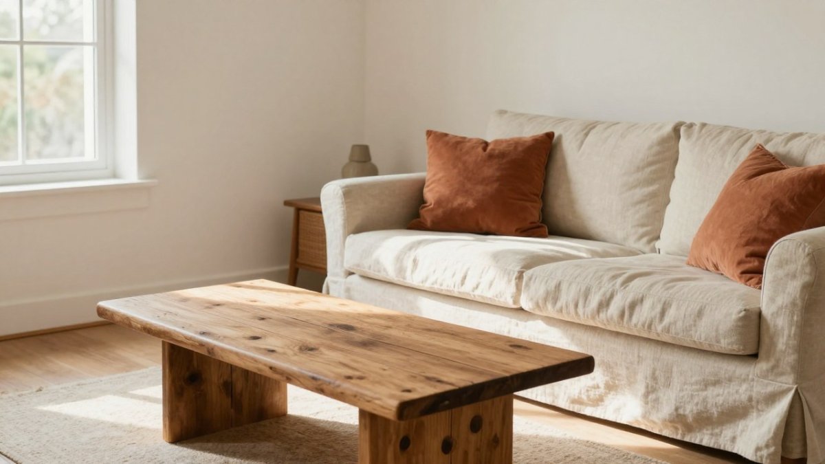
The shift is easy to explain. Cool gray reads blue or silver under warm artificial light, and in north-facing rooms it can turn flat and slightly cold. Warm neutral paint colors carry yellow, red, or green undertones that hold their softness through the day. Many designers now describe the move as a return to organic, earthy color after years of sterile white and gray.
What Counts as a Warm Neutral
A warm neutral is a low-saturation color built on a yellow, red, or green undertone rather than a blue one. Creamy white, beige, greige, taupe, and earthy tan all fall into this family. The tell is how the shade behaves at 7 a.m. versus 7 p.m.: warm neutrals gain depth in low light instead of going gray.
How We Selected These Seven Shades
Our picks come from shades named in 2026 trend coverage across Benjamin Moore, Sherwin-Williams, and Farrow & Ball. The factors that matter most are how the color reads in natural light, how it handles warm artificial lighting, how well it pairs with trim and flooring, and how forgiving it is in rooms with limited daylight. If you want a deeper walkthrough of choosing a palette, professional color consultation covers how a designer narrows options in your actual rooms.
| Shade | Brand | Color Family | Best Room | Watch For |
|---|---|---|---|---|
| Navajo White (OC-95) | Benjamin Moore | Creamy white | Living room, trim | Yellow undertone in bright sun |
| Accessible Beige (SW 7036) | Sherwin-Williams | Light warm beige | Whole home | Shifts lighter in bright rooms |
| Revere Pewter (HC-172) | Benjamin Moore | Warm greige | Bedrooms, halls | Can read gray in cool light |
| Agreeable Gray (SW 7029) | Sherwin-Williams | Warm greige | Open-plan living | Undertone shifts by room |
| Pale Oak | Benjamin Moore | Soft warm white | Kitchens, baths | Needs a warm bulb at night |
| Ballet White | Benjamin Moore | Warm off-white | Whole home | Low contrast against white trim |
| Elephant’s Breath | Farrow & Ball | Warm taupe | Accent walls, cozy rooms | Darker than photos suggest |
1. Benjamin Moore Navajo White (OC-95)
Navajo White is the softest entry on this list, and it earns the top spot for one reason: it makes a room feel bright without turning cold. The warm undertone keeps it from reading sterile, which is exactly the problem many homeowners had with cool white.
Walls and trim in the same color give a layered, blended look. In a bright southern exposure it can push slightly yellow, so test a large sample first. Watch out: a small swatch hides that shift, and a full wall will not.
2. Sherwin-Williams Accessible Beige (SW 7036)
Accessible Beige is a tried-and-true designer choice that reads light but warm, and the name tells you who it’s for. It suits homeowners who want beige without the yellow-heavy beige of the 2000s.
The shade can appear different in bright rooms, so a north-facing hallway and a sun-drenched kitchen may show two different colors. That is normal for warm neutral paint. Test in both rooms before you buy. If you’re pairing it with a fresh finish, our guide to choosing interior paint finish explains which sheen holds up where.
3. Benjamin Moore Revere Pewter (HC-172)
Revere Pewter is the warm greige that refuses to go out of style. It sits between gray and beige, with a green-gray undertone that keeps it grounded rather than flat.
This is our pick for bedrooms and hallways because it gains depth in low light instead of going muddy. In a cool north-facing room it can lean gray, so add a warm lamp and a wood floor to pull the warmth back out. Compare a sample against your flooring before committing.
4. Sherwin-Williams Agreeable Gray (SW 7029)
Agreeable Gray is a warm greige that works as a whole-home color for open-plan living. It blends with both warm and cool furnishings, which is why it stays popular in 2026 color collections.
Here’s what most guides miss: its undertone shifts from room to room, so a single swatch tells you very little. Paint two large samples on opposite walls and check them morning and evening. That five-minute test saves a repaint.
5. Benjamin Moore Pale Oak
Pale Oak (OC-20) is a soft warm white with a whisper of greige, Its low-saturation warmth keeps it from reading sterile the way a pure white can, but it is also the most light-sensitive pick on this list.
Where it works best: kitchens with white oak, rift-sawn oak, or painted cream cabinets; primary baths with light stone or quartz; and open living areas where you want the walls to recede.
Lighting behavior: in strong southern daylight Pale Oak holds a clean, creamy white. Under a 2700K bulb at night it warms up pleasantly; under a 4000K or cooler LED it turns slightly gray-green.
Pairings that work: white oak or natural hickory flooring, warm white trim (Benjamin Moore White Dove OC-17 is a common companion), unlacquered brass or warm bronze hardware, and stone with a cream or tan base rather than a blue-gray one. For a layered look, carry Pale Oak on walls and go one step deeper on the ceiling in a flat finish.
Watch out: Pale Oak has low contrast against bright white trim, so if you want crisp definition, choose a deeper trim white or move the walls a half-step down the strip. Always test it on two walls, because a single swatch hides the shift between a sunlit window wall and an interior wall.
If you are weighing it against similar soft whites, compare it side by side with Benjamin Moore Swiss Coffee (OC-45) and Sherwin-Williams Alabaster (SW 7008); the three read close on a chip but diverge sharply on a full wall.
6. Benjamin Moore Ballet White
Ballet White (OC-9) is a warm off-white with a soft cream undertone that can carry an entire home without any room feeling sterile. It sits just off true white, so it reads as a gentle neutral rather than a statement.
Room-by-room fit: it is strongest in living rooms, dining rooms, and open-plan spaces where you want continuity from room to room. In a primary bedroom it stays restful; in a bright kitchen it can wash out next to white cabinets, so pair it with a deeper island color or warm wood. In a low-light basement it can go slightly chalky, so add a warm lamp layer before judging it.
Trim and ceiling strategy: Ballet White can be used as a blended choice, walls, trim, and ceiling in the same color, with the trim in a satin or semi-gloss sheen and the ceiling in flat. That sheen contrast is what keeps a monochrome room from looking flat. If you want visible trim definition instead, step the trim to Benjamin Moore White Dove (OC-17) or Simply White (OC-117).
Flooring and furnishings: it pairs naturally with white oak, warm walnut, jute and sisal rugs, linen upholstery, and earthy accents like terracotta, clay, and olive. It is less forgiving against cool gray flooring or chrome-heavy fixtures, which can pull the cream undertone toward yellow.
Comparable shades: if Ballet White is unavailable or you want to compare, Sherwin-Williams Creamy (SW 7012) and Benjamin Moore Swiss Coffee (OC-45) sit in the same warm off-white family; compare them on the same wall because their undertones diverge under artificial light.
Watch out: against bright white trim the contrast is low, so homeowners who want crisp definition often end up disappointed. Decide up front whether you want a blended or a defined look, because that choice drives the trim color more than the wall color does.
7. Farrow & Ball Elephant’s Breath
Elephant’s Breath is a warm taupe that reads more muted and earthy than the whites above. It suits accent walls and cozy rooms where you want depth without a bold color.
The catch is that it looks darker on a full wall than on a small sample, so test it in the room’s actual light. Once you’ve settled on your shades, our interior painting service handles the prep and finish, and you can contact our team to schedule a walkthrough. For kitchen inspiration that builds on these warm tones, see our picks for the best paint colors for kitchen cabinets.
The right warm neutral can make a whole home feel calmer and more current, but the wrong undertone under your lighting will nag at you every day. At Rooster Painting, we bring over 19 years of experience, a free color consultation, and a worry-free warranty to every interior project, so the shade you choose is the shade that lands on your wall. Get started with Rooster Painting and refresh your space with a color you’ll love for years.
Frequently Asked Questions
What is the best warm neutral paint color?
There is no single best shade, because the right warm neutral paint depends on your room’s lighting and your furnishings. Sherwin-Williams Accessible Beige (SW 7036) is a safe starting point for open living spaces, while Benjamin Moore Navajo White (OC-95) suits readers who want a warm white rather than a beige. Buy samples of two or three shades and paint them on the actual wall before deciding.
What color is replacing beige and gray in 2026?
Warmer, earthier neutrals are taking over from flat beige and cool gray. Greige blends like Benjamin Moore Revere Pewter (HC-172) and Sherwin-Williams Agreeable Gray (SW 7029), plus deeper earthy tones such as Farrow & Ball Elephant’s Breath. These shades keep the versatility of a neutral but add a golden or taupe undertone that reads cozier than the gray of the past decade.
Which warm neutral paint colors work best in a kitchen?
Kitchens need shades that hold up under both daylight and evening artificial lighting. Creamy whites like Benjamin Moore Ballet White and Sherwin-Williams Shoji White keep cabinets feeling open, while Accessible Beige works well on surrounding walls. Test any shade next to your cabinet finish and countertop, since a warm neutral paint can shift toward pink or yellow against stone and wood.
Are warm neutral paint colors a good choice for exterior walls?
Yes, with one adjustment: exterior light is harsher, so warm neutrals often dry lighter and less saturated outside than they look on a sample card. Test shades on a south- or west-facing wall and check them at midday and again near sunset. Pair a warm neutral body color with a slightly deeper trim shade so the house keeps definition instead of washing out.
How do I choose a warm neutral paint color for my home?
Start with the undertone, not the name. Hold sample cards against your flooring, then paint large swatches on two walls in the same room and watch them through the day. Warm neutral paint can look creamy in morning light and almost tan by evening. If you are repainting several rooms, pick one whole-home shade and use a slightly deeper tone for accent walls to keep the palette connected.
